

Overview
In this article, you are going to learn about how to change the position of elements using the different type of positioning method available in CSS: static, relative, absolute, fixed and sticky. You will also use the CSS position property to create a beautiful blog post card. At the end of this article, you will have known when & how to apply CSS position property.
Prerequisites
- Basic knowledge of HTML and CSS
Normal HTML Flow
HTML is used to define the structure of a web page. The order in which elements are arranged in the HTML code is how they are being rendered by the browser until the elements are being styled. The browser renders the elements from top to bottom as they are written in the HTML codes. For instance, the p element at the end of an html code cannot be displayed by the browser on the top of page. However, applying CSS can make that happen.
The punch line is that order comes from HTML code.
Positioning Method
There are five different types of positioning method available in CSS. The CSS property called position takes the positioning method as its value for an element.
Position (as a verb) means to put or arrange (someone or something) in a particular place or way.
When we want to arrange or put something, are we not going to move the thing? That means, in order to change the position of something, there must be motion and motion involves movement, isn't it? Offset properties are the forces that are used for moving elements.
This illustration shows that position property does not work alone, it works alongside with what is called offset properties.
The Offset properties are
- top
- bottom
- left
- right
As it can be inferred from the name offset, offset properties works in an 'offset' way so to write. It counteracts what the name says it does.
top is used to specify the distance the top edge of an element is moved below not the distance the element's top edge is moved above. left is used to specify the distance the left edge of element is moved to the right not the distance the element's left edge is moved to the left. The same logic is applicable to right and bottom. The values of the offset properties are usually given in pixels, percentages, rems or ems.
You must have gotten the logic now. If you haven't, you can re-read the last paragraph. When we get to the Practical section, you will understand it more.
- Static: This is the default positioning method used by all element in HTML codes. It is positioned using the normal HTML flow. Offset properties don't work on element that are positioned using static.
- Relative: This positions an element relative to the position it would have been in normal flow. The space taken by this element is not taken up by other elements; it does not affect position of the surrounding elements.
- Absolute: This positions the element in relation to its containing element. It is taken out of normal flow and other elements will take up the space taken up by the elements previously as if the positioned element wasn't there.
- Fixed: This positions the element in relation to the browser window (viewport). When a user scrolls the page, it stays in the exact same place. This is often used when creating a go to top link and menu bar.
- Sticky: This positions the element based on the user's scroll position. A sticky element toggles between relative and fixed, depending on the scroll position. It is positioned relative until a given offset position is met in the viewport - then it "sticks" in place (like position: fixed).
z-index property
When you move any element from normal HTML flow, elements overlap. The z-index property
allows you to control which element appears on top.
You can think of the z-index property as what you do when you move to the front of a physical classroom so as get closer to the board if other students are obstructing your view. You moving to the front cause other student to be behind you. The board here refers to the top of the screen and you; the student refer to the element that will be on top.
Here is another analogy, If you have experience working with graphic design software, you should know about 'bring to front' and 'send to back' features. The Z-index property works the same way as well. It's just that number is being used to show the hierarchy here.
z-index is also called stacking context. z-index property takes number (both positive & negative whole numbers) as its value. z-index only affects elements that have a position value other than static (the default).
Practical
As mentioned in the overview, we are going to create a beautiful blog post card with what we have just learnt.
NB: To get the image used and complete HTML & CSS files. It can be gotten from this github repo
Here is the HTML code
<!DOCTYPE html>
<html lang="en">
<head>
    <meta charset="UTF-8">
    <meta http-equiv="X-UA-Compatible" content="IE=edge">
    <meta name="viewport" content="width=device-width, initial-scale=1.0">
    <link rel="stylesheet" href="style.css">
    <title>Blog Post Card</title>
</head>
<body>
    <div class="container">
        <div class="post-card">
            <div class="img-container">
                <img src="blog_2.jpg">
                <div class="date">
                    <p class="day">15</p>
                    <p class="half-date">Dec, 2021</p>
                </div>
            </div>
            <div class="heading">
                <h1>New changes in our Church from 2021</h1>
                <p class="post-info">By James Smith | In Community | 2 Comments</p>
            </div>
            <div class="post-body">
                Praesent malesuada congue magna at finibus.
                In hac habitasse
                platea dic tumst malesuada congue magna at finibus.
                In hac habitasse platea. Praesent malesuada congue
                magna at finibus. In hac habitasse platea dic tumst
                malesuada congue magna at finibus.
                In hac habitasse platea.
            </div>
            <a href="#" class="read-more">Read more</a>
        </div>
    </div>
</body>
</html>
Here is the style.css code (no position style has been applied)
* {
    box-sizing: border-box;
    margin: 0;
    padding: 0;
}

:root {
    font-size: 16px;
}

.container {
    max-width: 1200px;
    margin: 0 auto;
}

.post-card {
    margin: 25px 0 0;
}

h1 {
    font-size: 30px;
}

.post-info {
    color: red;
}

.read-more {
    text-decoration: none;
    color: red;
    font-style: italic;
}

p.day {
    font-size: 2.2rem;
}

.heading {
    margin-top: 15px;
}

.post-body {
    margin: 15px 0;
}
Looking at the blog post card and the codes shown above, where do you think positioning method can be applied? Here are a few pointers:
- Where can you see an overlap?
- Which element changed position so far in the rendering of the current code by browser compared to the blog post card
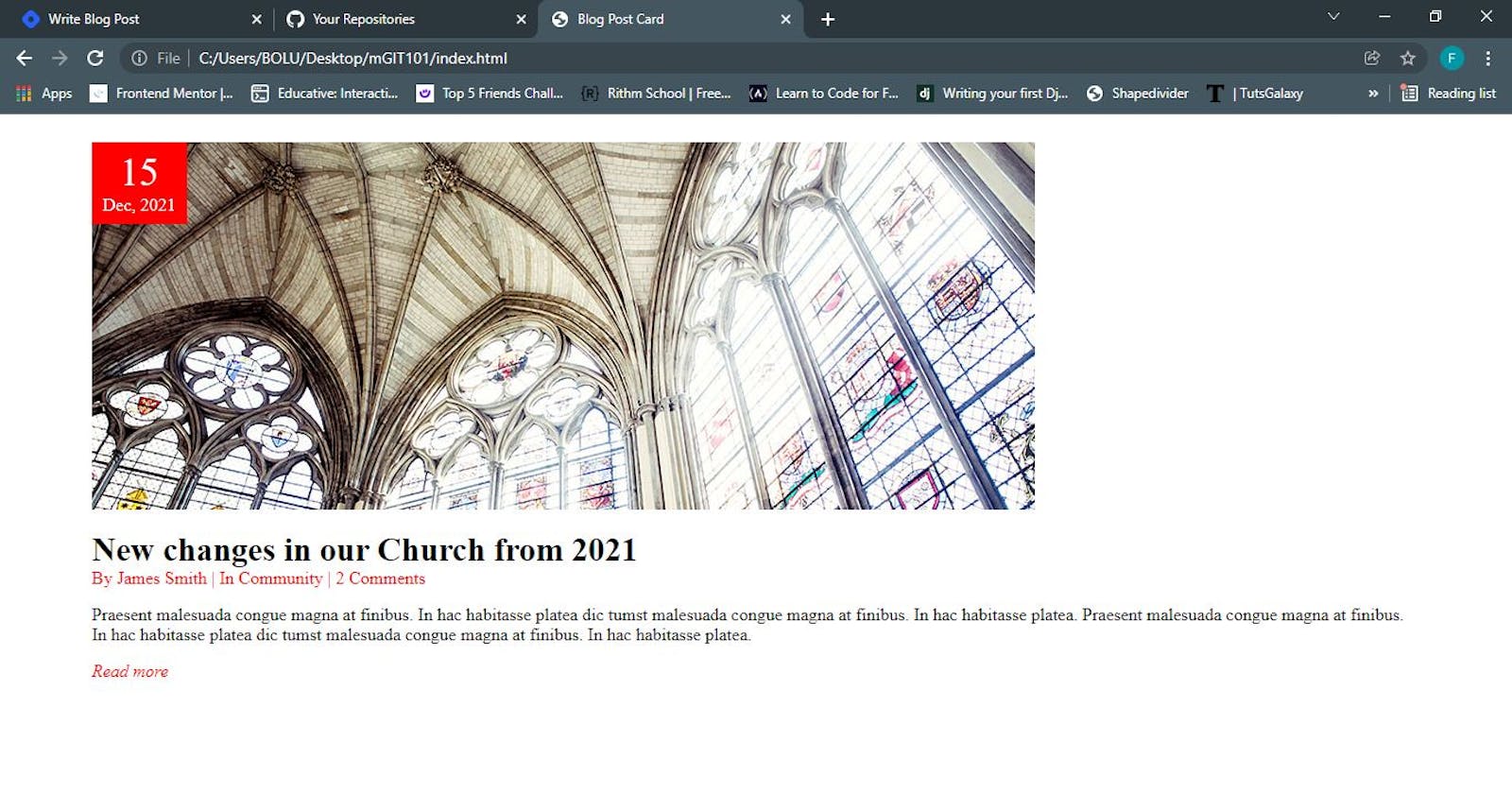
You have the answer now😉😊. It's the element that has 15 Dec, 2021 has its content(that is, div.date). Here is a list of what we are doing to do next
- make the
div.dateelement sits on theimgelement by setting positioning method - set
div.dateto the appropriate position using offset properties - set
div.dateto be closer to the top.
div.date needs to be taken out of the normal HTML flow. To do that, we set the position property value of div.date element to 'absolute' and make it stuck to the top-left corner of the page by setting top to 0 & left to 0. As at this point, div.date is positioned relative to the document body because it has no positioned ancestor/parent element.
This is what the page should look like 👇.
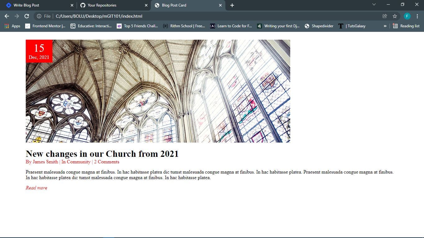
 Referring to the explanation given under the positioning method, it can be observed that the
 div.heading content moved up to take the div.date space immediately it was taken out of normal HTML flow.
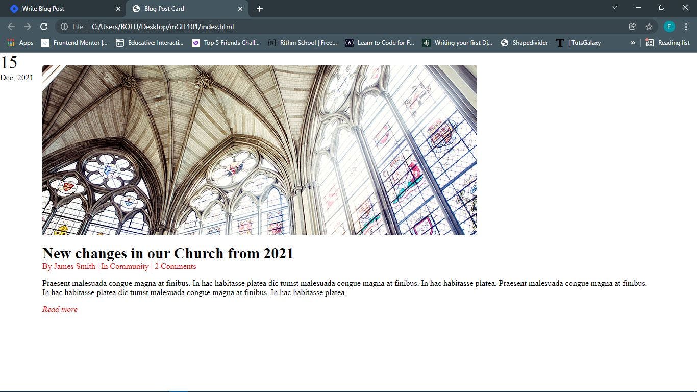
To position div.date relative to the div.img-container, we set the position property of div.img-container to relative.
This is what the page should look like 👇.
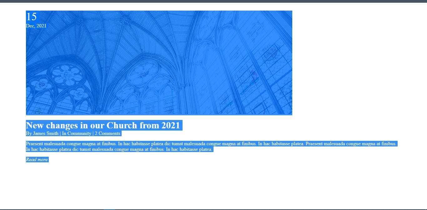 I deliberately highlighted all the content of the page so the date can be visible
The next thing is to set the background-color, color, text-align, padding of div.date to make it visible & beautiful.
Here is the final CSS code.
* {
    box-sizing: border-box;
    margin: 0;
    padding: 0;
}

:root {
    font-size: 16px;
}

.container {
    max-width: 1200px;
    margin: 0 auto;
}

.post-card {
    margin: 25px 0 0;
}

h1 {
    font-size: 30px;
}

.post-info {
    color: red;
}

.read-more {
    text-decoration: none;
    color: red;
    font-style: italic;
}

p.day {
    font-size: 2.2rem;
}

.heading {
    margin-top: 15px;
}

.post-body {
    margin: 15px 0;
}

.img-container {
    position: relative;
}

.date {
    position: absolute;
    top: 0;
    left: 0;
    color: white;
    text-align: center;
    background-color: red;
    padding: 8px 10px;
}
We didn't use z-index property at all and the div.date is sitting on top of the image. Here is the reason
If two positioned elements overlap without a z-index specified, the element positioned last in the HTML code will be shown on top.
Try setting z-index value of div.date to -1 and see what will happen😉.
You can read more on z-index here
Final Thoughts
Here is a list of websites that you might want to checkout to practice your frontend skills and bookmark for reference purpose.
Kindly share websites you find useful as well in the comment section. I will like to check them out.
Thanks for reading this.
Don't forget to like, clap, comment and share🤗